Friday, May 19, 2017

Gum Bichromate

By: Guido Montanes Castillo
Gum bichromate is a printing process based on the sensitivity of dichromates. It's capable of
performing painterly images from photographic negatives.

Wednesday, May 17, 2017

Cyanotype

By: Anna Atkins
Cyanotype is a process that uses blueprints. It uses two kinds of chemicals which are Potassium
Ferricyanide and Ferric Ammonium Citrate.

Alternative Processes

Wet Plate Collodion by: Emma Bjorndahl


 It's a type of photo where you have to put an image on a glass plate. You have to use iodide and add it to nitrate and then coat it on a glass plate.

Monday, May 15, 2017

Layer 2

For this layer, I decided to put together a potato head and two different plants.
I used these photos because, I thought it would be cool to see a potato head surrounded by plants
instead of toys like in the movie.

Layer 1

I was trying to make it look as though the house,tree and rose are all on the landscape of the road
or how everything would look like if they were all surrounding the house. I wanted it to be this way because, I wanted to see what it would look like it if different things were layered together in different areas and places.

Thursday, April 27, 2017

Macro 3

My intention was to put different textures together that teachers have around their classrooms.

Macro 2

My intention was to find things that you you would use to clean around the house or wipe the whiteboard. Unfortunately, I didn't have three more so I just put textures of curtains that teachers hung on their doors.

Macro 1

I was trying to capture different textures of plants around the school and a couple of roses. I was mainly trying to find things that would be seen in nature.

Edit 4

For the first edit, I mostly increased the tools I used for example temperature, clarity, and saturation. I did it that way because, it made the roses more of a bright feeling and it looks like it would light up a room if you were to put them somewhere. For the second edit, I made it look like a gray feeling if someone were to look at it. I also made it this way because, it somewhat looks like a dark feeling when I look at it. For the last edit, I made it so that the feeling is calm and relaxed if you were to approach it.

Tuesday, April 25, 2017

Edit 3

For each of the edits I did, I made it look like it went from a joyful, calm or peaceful feeling. I did it this way because, it made each one look a little a more different in its own way. The first one looks like a soothing feeling which I think feels nice. The second one feels like a wind is about to come through which I think is a cool feeling. The last one feels like a scene when it's almost ready to get dark during the day which I like because then I get to go to sleep.

Edit 2

For the first edit, I increased many of the tools such as temperature, contrast, highlights and shadows so that it looks like more of a bright feeling. I made it look this way because it makes the background and the whole photo itself look interesting to me. For the second  edit, many of the tools I used were decreased such as exposure, contrast, highlights and clarity so that it looks more of a nice scenery when someone were to look at it. I was trying to make it look like a nice and calm feeling. For my last edit, half of the tools I used were increased and decreased. The tools that I used were exposure, contrast, clarity and vibrance. I made it look as though it were a sad and gloomy feeling and scene.

Thursday, April 20, 2017

Edit 1

For my first edit I edited it to look like it was a dark and sad feeling when you look at it. The second edit is more of a gray and calm feeling. I edited that way because it looked pretty cool and nice to me. I edited the third one so that it looked like a bright and joyful feeling. I edited it this way because one of the tools I used to edit made it really nice to me and thought it was interesting.

Tuesday, April 4, 2017
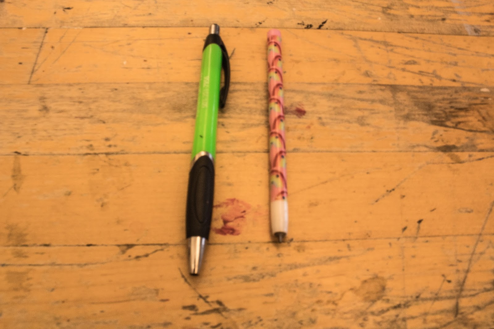
Camera Controls

For the shallow depth of field, I had a aperture of 5 and for the deep depth of field I had a aperture of 14. What I did to get these photos was first I set my camera to aperture priority mode. Then I put the potato head where I wanted it to be taken. After that I started taking shots. I had to put the camera flat on the table so that my hand wouldn't wobble and also so that the photo would be more clear. For my frozen motion the exposure time was 1/100. This kind of photo keeps the moving subject in  near  or complete focus. For my blurred motion the exposure time was 0.3. This kind of photo is when you can see the subject in motion and has a fast shutter speed.

Tuesday, February 7, 2017

Friday, January 27, 2017

I took this photo around the holidays. It was a time when everyone is ecstatic and having a great time with their family. I thought I would capture this because the colors around my grandma and I which are mostly red and green give off a happy mood.

Complementary Grid

Wednesday, January 4, 2017

Mood Photo By A Photographer

Abby Batchelder uses mood to express an ecstatic mood. It shows how the baby is having a good time while  taking a bath. The yellow rubber duck emphasizes like a happy feeling. The photo shows how it's a calm tension and the baby looks relaxed.